


Data Visualization in Data Analytics: With the growing dependence on data for decision-making, businesses today are looking for ways to better understand the information they collect. Raw data, while rich with insights, can often be difficult to interpret and act upon. This is where data visualization in business analytics becomes a game-changer.
How, you may be wondering – data visualization in business analytics help convert data into clear and engaging visuals, so companies can quickly understand trends, identify patterns, and make smarter, data-driven decisions.
In this blog, Learning Labb will walk you through the best practices, tips for data visualization, and 16 key types of visualizations that are central to the growth and overall success of your business.
This article contains the following:
- Data Visualization in Business Analytics
- Types of Data Visualization in Business Analytics
- Tips for Data Visualization
- Data Visualization Best Practices
- Advantages and Disadvantages of Data Visualization
Data Visualization in Business Analytics: What is the Importance?
Visualization in business analytics serves as a bridge between raw data and practical insights. It allows businesses to convert numbers into charts, graphs, and infographics, businesses can better understand trends, patterns, and outliers that may otherwise go unnoticed.
Visual data representations make it simpler to communicate complex information to stakeholders, enabling faster decision-making. For example, a well-crafted dashboard can help executives monitor KPIs (key performance indicator) in real-time, while a detailed chart can aid analysts in spotting trends in sales data.
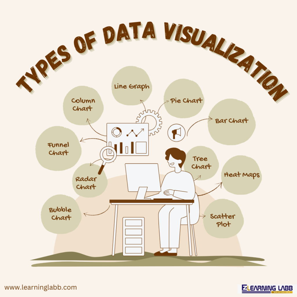
16 Types Of Data Visualization in Business Analytics
Here are 16 types of data visualization in business analytics that organisations can use depending on the data:
- Chart: A general term for a data representation that allows for a clear visual interpretation of complex data.
- Table: Displays data in rows and columns, making it easy to look up specific values.
- Graph: Represents data points on a coordinate system, useful for showing relationships and trends.
- Geospatial: Maps data to geographical locations, useful for location-based analysis.
- Infographic: Combines graphics, charts, and minimal text to present data in an engaging, informative way.
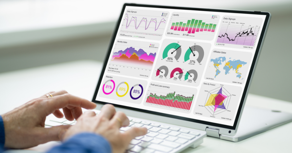
- Dashboards: A collection of different data visualizations, often interactive, providing a comprehensive view of the data.
- Area Map: Uses shaded areas on a map to represent the magnitude of a variable in different locations.
- Bar Chart: Represents categorical data with rectangular bars, making it easy to compare different categories.
- Box-and-Whisker Plots: Show the distribution of data based on a five-number summary: minimum, first quartile, median, third quartile, and maximum.
- Bullet Graph: Combines a bar graph with a target marker, useful for displaying performance data.
- Gantt Chart: Visualizes a project schedule, showing tasks over time.
- Heat Map: Uses colour intensity to represent data values, helpful in spotting trends and outliers.
- Highlight Table: A table that uses colour to highlight the importance or impact of the data.
- Histogram: Displays the distribution of numerical data by showing the frequency of data points within specified ranges.
- Pie Chart: Represents proportions of a whole, where each slice represents a category’s contribution.
- Treemap: Displays hierarchical data as nested rectangles, with the size of each rectangle proportional to the data value.
What Is Some Data Visualization Best Practices?
Here are important tips to help you get the best data visualization for business analytics:
- Right Visualization
- Simplicity
- Consistency
- Colours
- Focus
- Accuracy
- Context
- Visuals
- Test and Refine
- Right Visualization: The choice of visualization can make or break the analysis. Each type of data requires a specific visualization format. For example, bar charts are excellent for comparing categories, while heat maps are better for visualizing large amounts of data. Knowing which chart or graph to use in different situations is crucial for accurate and effective data interpretation.
- Simplicity: Simplicity is key. The goal of data visualization in business analytics is to convey the data’s message as clearly as possible. Avoid unnecessary elements that clutter the visuals. Stick to a minimalistic design that enhances comprehension.
- Consistency: Consistency in fonts, colors, and scales is essential. When multiple visualizations are used in a dashboard or report, maintaining a uniform style helps users navigate the data more efficiently.
- Colours: Colors can enhance or mislead your audience. Use contrasting colors to highlight key data points and avoid using too many colors, which can confuse the viewer.
- Focus: The most significant insights should stand out. Use bold colors, annotations, or labels to draw attention to the most important data points or trends.
- Accuracy: While visual appeal is important, the accuracy of the information being displayed must not be compromised. Ensure that visualizations are based on accurate data and are presented in an unbiased manner.
- Context: The visualizations should include necessary labels, titles, and legends so that your audience can understand the data without additional explanations.
- Visuals: Where possible, make your visuals interactive. Interactive dashboards, for example, allow users to explore the data at their own pace.
- Test and Refine: Before finalizing any data visualization, test it with your target audience. Ask for feedback and refine the visualization based on their responses to ensure the message is clear and impactful.
Tips for Data Visualization in Business Analytics
Crafting clear, effective visualizations is not just about selecting the right chart or graph. Here are a few tips for data visualization that can help improve visual representations of data:
- Avoid clutter: Remove unnecessary elements like gridlines or redundant data points that could distract viewers from the main message.
- Avoid misleading visuals: Make sure the scales are consistent and accurate to prevent misleading interpretations.
- Add interactive visuals: Consider making your visualizations interactive, allowing users to filter, zoom, or hover over data points for additional context.
- Focus on the important findings: Highlight the most important data points so that the audience knows where to focus.
- Maintain consistency: Use the same type of chart, font size, and colour scheme throughout your visualizations to maintain uniformity.
- Update regularly: Keep the visuals updated to reflect the latest data, especially in constantly changing business environments.
- Know your audience: Tailor your visualizations to the audience’s level of data literacy. Executives may prefer high-level visualizations, while analysts might need more granular data.
- Get feedback: Regularly seek feedback from users to improve and refine your data visualization techniques.
- Make use of automation tools: Modern business intelligence tools such as Tableau, Power BI, and Google Data Studio automate much of the visualization process and help standardize reports for consistent decision-making.

What Are The Advantages and Disadvantages of Data Visualization?
Now that we have covered almost all the important aspects when it comes to data visualization in business analytics, let’s not forget yet another important aspect – the advantages and disadvantages of data visualization.
| Advantages | Disadvantages |
| Simplifies complex data | Can be misleading if not done correctly |
| Helps in spotting trends and outliers | May oversimplify data and ignore important details |
| Improves decision-making | Requires skill and software to create |
| Makes it easier to share insights with stakeholders | Inconsistent color use can cause misinterpretation |
| Facilitates quick understanding of data | Too many visualizations can overwhelm the audience |
| Engages the audience with interactive visuals | May require significant time and resources |
On A Final Note…
Data visualization in business analytics is a powerful tool that allows companies to transform data into valid and practical insights.
Whether you’re a seasoned analyst or just starting, the above data visualization best practices and tips for data visualization will guide you in creating visuals that not only look good but also convey powerful insights.
For more information, connect with us today! Click here…